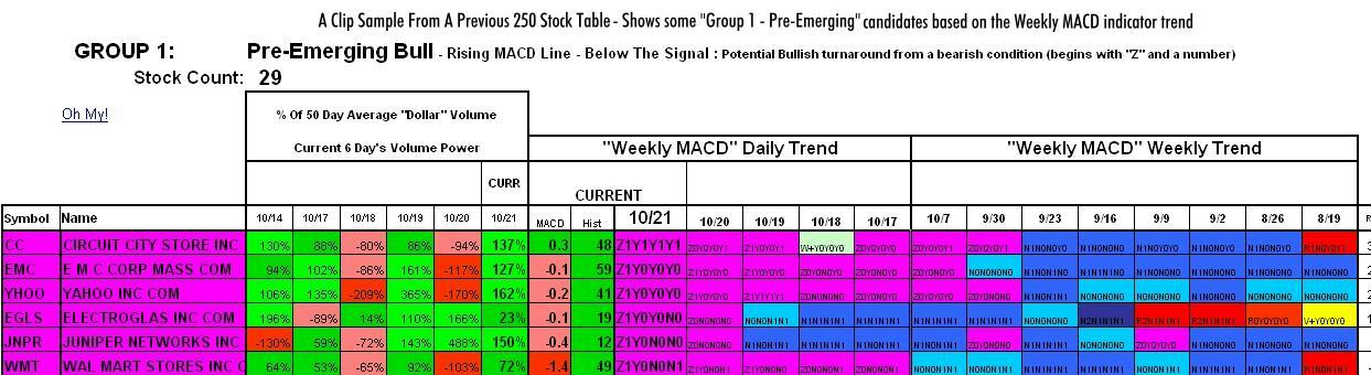
I've also added a histogram column "Hist". Some consider a good early entry point as being when the histogram trend begins to improve from a well established declining trend (and vice-versa for an exit). The histogram shows the trend of the gap between the MACD line and the signal line. This histogram sometimes improves before the MACD line begins to rise, so look for early bullish histogram signals in my "bear" groups. A positive number is an improving weekly MACD histogram trend, a negative is a declining trend. The tens digit of the number represents the number of weeks the trend has been intact. The ones digit represents the weeks of the opposite trend prior. A value of 58 means the Weekly MACD histogram has been improving for 5 weeks and the prior decline trend lasted 8 weeks, -159 means the histogram has been in a decline for 15 weeks and the prior rise was 9 or more weeks (9 is as high as the prior trend will measure).
Welcome to my site and thanks for stopping by! Investment research can be a time consuming process. Time is precious, and I personally find it tiring flipping through chart after chart looking for stock trends that spark my interest. From a desire to save time, I have been developing charts and tables that condense volume, fundamental, moving average, and other technical data and trends. I find that volume and moving average statistics make a great pair in spotting important stock movement trends.
Here I share the tables I use in helping me make investment decisions. My quest to condense the data is an ongoing process so some charts and tables will evolve over time. I attempt to describe each table in its directing page. I understand that some tables may be difficult to grasp at first look. I welcome all questions and desire suggestions.
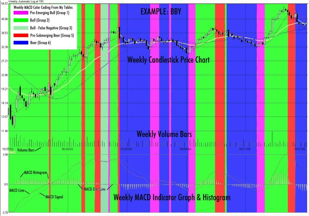
The "Weekly MACD" Indicator and Volume Power: Many of my tables here key in on these two indicators. These are the indicators that I personally monitor first. These indicators are not geared towards day trading as I am not a day trader, but rather a trend investor. I believe you need to follow companies which you are familiar with. From there I follow them business-wise and stock-wise. Stock-wise, I use my 250 list. I find the "weekly MACD" indicator a good one for determining intermediate term stock price trends. I avoid a stock when this indicator is in a bearish down trend (Group 6 in my MACD tables). I strongly consider an entry position when the bearish Weekly MACD trend starts turning positive (Group 1 in my MACD tables) and the business fundamentals are sound. I also look for an increase in volume in the turn to demonstrate strong accumulation. Keep in mind this turn may be a result of a known upcoming event, like an earnings release, in which speculators pile into and then exit right before the report. So you need to be aware of these scheduled events so you don't get caught holding the bag. You also need to follow overall market trends, as it is hard to buck a down market.
I strive to present stock and market performance data in a meaningful, colorful format. Volume and moving average trends are front and center. Price action, though important, takes a back seat. The volume is the power that drives a stock, the amperage. Without this power, price action has weakness and can give the wrong signal. The colors make spotting trends, strengths and weaknesses easier than looking at charts and lines. The sorting and presentation make it much easier to compare performance, stock by stock, on one page. Take a look at the graphs and tables here and see the different light they shine on technical analysis.
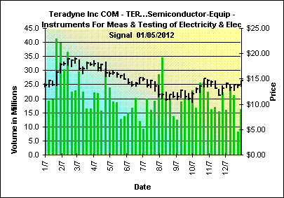
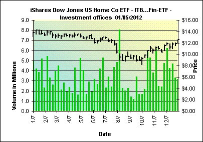
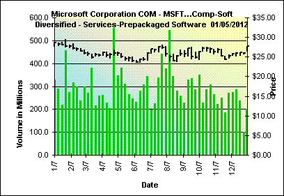
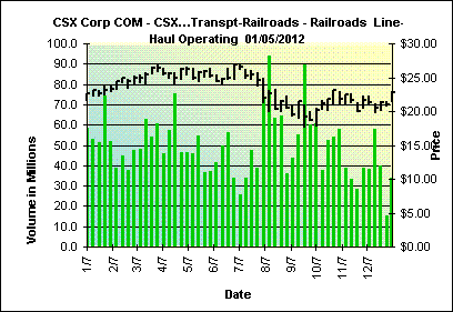
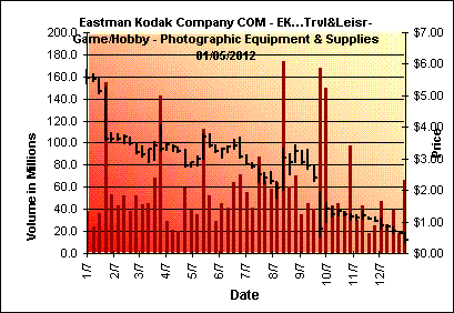
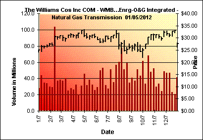
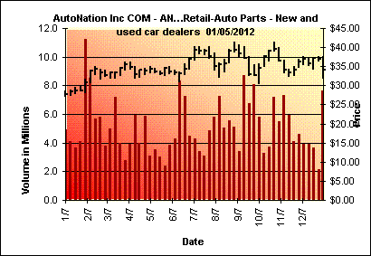
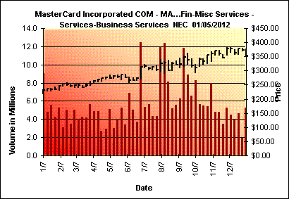
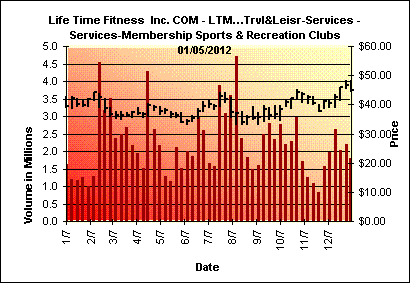
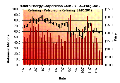
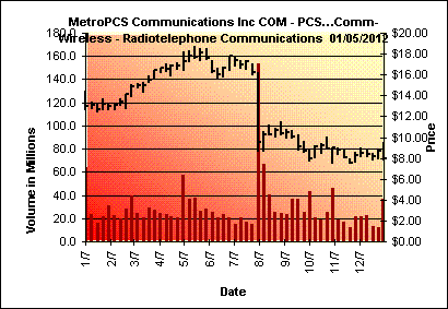
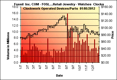
Featured Upside Power Volume Stocks (1 year weekly data) Taken from components of the S&P 500, NASDAQ 100, and my 250 and ETF lists:
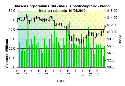
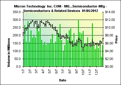
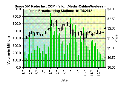
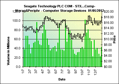
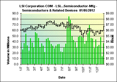
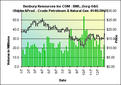
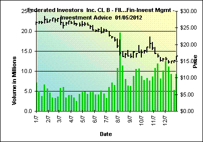
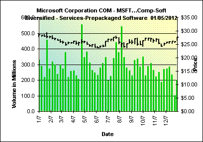

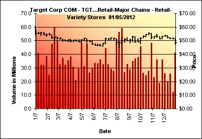
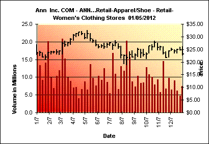
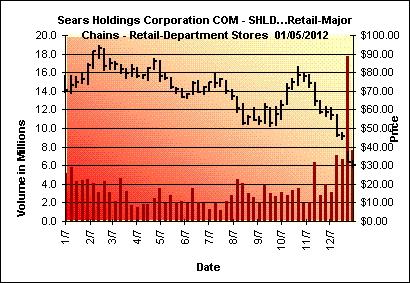
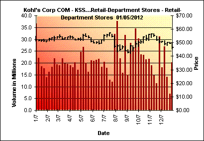
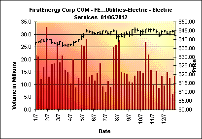
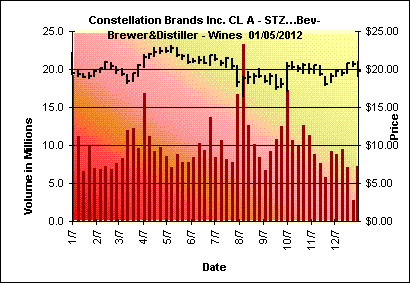
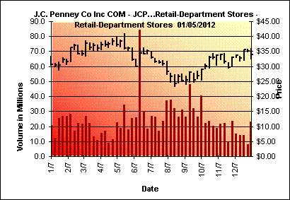
Featured Downside Power Volume Stocks (1 year weekly data) Taken from components of the S&P 500, NASDAQ 100, and my 250 and ETF lists:
-
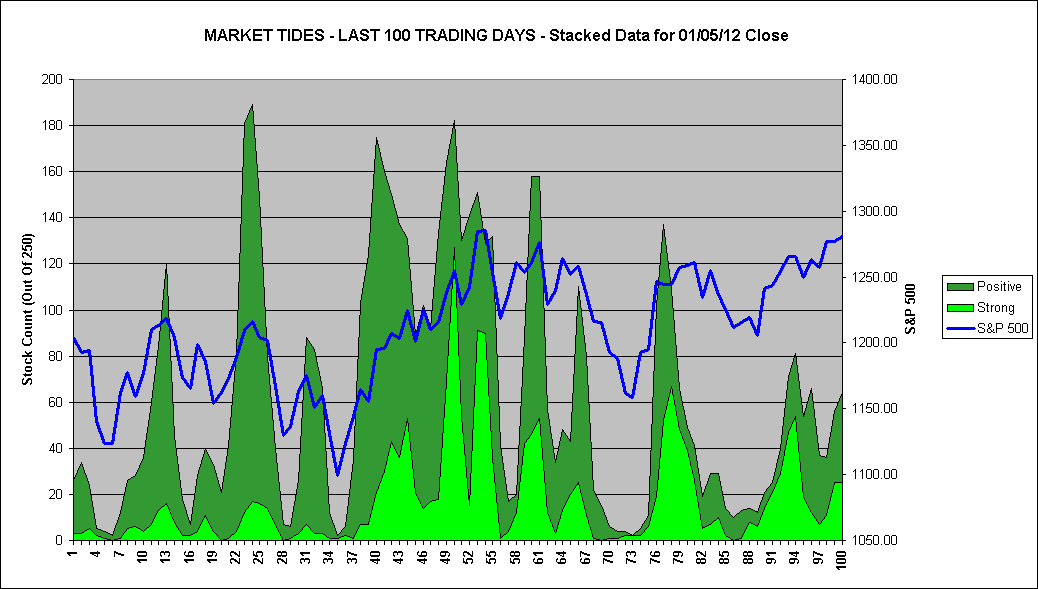
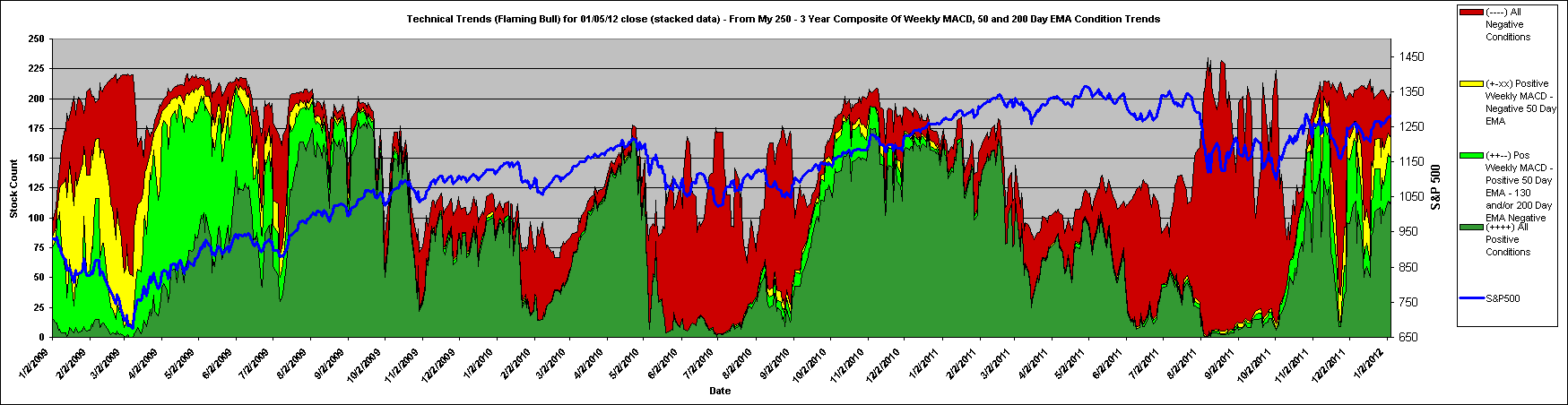
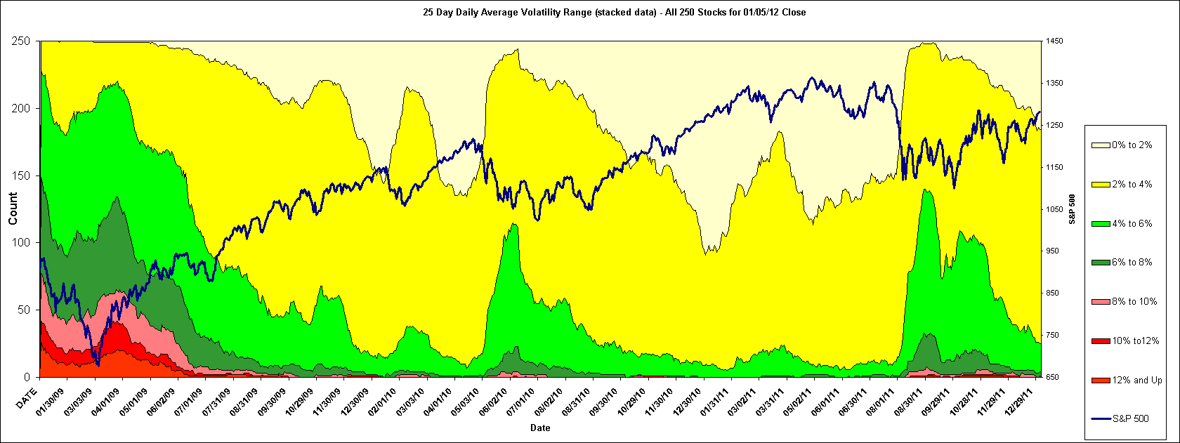
The above graph is an oscillator utilizing various technical indicators. It is an abbreviated shorter period version of this graph. It considers the 250 stocks I follow.
To qualify for a "STRONG" rating, a stock in my 250 must have all of the 3 following conditions:
To qualify for a "POSITIVE/GOOD" rating, a stock in my 250 must NOT have any of the following conditions:
____________________
The data for the
tables and graphs on this site is based on 250 stocks that I follow. The link above
lists these stocks. I try to keep the list diversified. At times I am required
to make changes to this list due to mergers and bankruptcies. At other times I
find a new stock of interest and replace one of lesser interest. These changes
are few are far between and have little effect on the overall trends
represented. From time to time I will feature certain sectors that I feel are
compelling.
The charts and
tables here do not represent any recommendation from myself to buy or sell any
security. I also do not guarantee the accuracy of these charts and graphs as
the data is provided to me without guarantee.
This site is always under construction and will be expanding with more trend aids in the future. The tables and graphs are created with Excel 2000. I have found that some browsers do not correctly display some of my larger tables correctly. I know Microsofts Internet Explorer versions 5 and above will properly display all of my creations. Also, my display is set at 1280 x 1024 resolution, therefore my tables are created to display visually at this resolution.
I welcome and encourage feedback. I promise to keep your address confidential.