First a quick word. Some of these tables are huge, 5 megabytes for the first with 716 stocks. Of all the
tables I have created, I believe these contain the most comprehensive set
of information and easy to spot color coding of important "absolute" trends and "relative"
strengths of both technical and fundamental data. They are sorted by their current "weekly MACD" conditions:
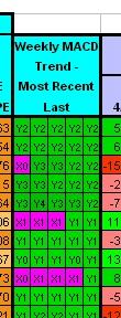 The highest rated leads each condition. Within each same condition, stocks are sorted by those closest to
their 1 year highs. In this sample, the strongest current "weekly MACD" condition is "Y2" (see
more detailed explanations further down the page). The current trading
day's condition is to the right. Previous trading day's trail to the left. You are looking at a five
trading day trend. Conditions are grouped in similar colors, example: Green being positive - rising
"weekly MACD" line, above the signal. Blue being negative - falling "weekly MACD" line,
below the signal. The number represents the strength - the higher the stronger. Color coding
for these five columns vary from the rest of the table so as to correspond with the
many other "weekly MACD" tables on this site.
The highest rated leads each condition. Within each same condition, stocks are sorted by those closest to
their 1 year highs. In this sample, the strongest current "weekly MACD" condition is "Y2" (see
more detailed explanations further down the page). The current trading
day's condition is to the right. Previous trading day's trail to the left. You are looking at a five
trading day trend. Conditions are grouped in similar colors, example: Green being positive - rising
"weekly MACD" line, above the signal. Blue being negative - falling "weekly MACD" line,
below the signal. The number represents the strength - the higher the stronger. Color coding
for these five columns vary from the rest of the table so as to correspond with the
many other "weekly MACD" tables on this site.
The tables are designed to be viewed
at a screen resolution of 1280 x 1024. Smaller resolutions will require more
scrolling. Check the color legend at the bottom. Certain colors represent "absolute"
conditions while other colors represent "relative" conditions. "Absolute" meaning
the condition "IS" bullish, turning bullish, bearish, or turning bearish. "Relative"
conditions meaning at the top or bottom relative to the whole group. These color conditions
do not apply to the five "weekly MACD" trend columns, which have their own separate
definitions to remain consistent with the many other "weekly MACD" tables throughout my site.
I am trying to
find a way to get the column titles to remain fixed at the top, but have not, as
of yet, found a way to accomplish this in "Excel to Web Page" conversion. If you
know a way in Excel, let me know! It needs to be done in the "save as web page" process. This
page is unfinished at this point, so if you have any questions, feel free to email
me. My email link is at the bottom of the page.
The Tables:
S&P 500 and NASDAQ 100 components, ETFs and my 250
S&P 400 MidCap components
S&P 600 SmallCap components
Screened beaten down stocks on the rise - 25% or more below their 52 week high from the above indexes
Below I give full explanations of the table sections (still under construction).
The Sample Tables - The sample tables below are not current. They are for explanation
purposes only. They are taken from an actual historical
table and the relative color indicators are accurate for the table they are taken from.
The relative color ratings are based on the whole table this sample was taken from
and not based on only those in the sample table. The red cells apparently do not
take well to JPEG conversion, this occurs only in the samples below - the actual
tables are clear. To access the current tables,
click the links above.
*
*
______________________________________________________________________________________________________________________________________________
SYMBOL AND COMPANY NAME: These are color coded for absolute bullish/bearish
conditions based on the 50 day moving average indicator for the stock:
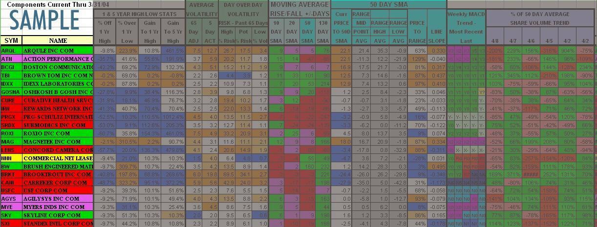
- Purple = Turning Bullish - I keep a strong eye out for these. The 50 day
moving average is FALLING, BUT the current stock price is ABOVE the 50 day
moving average, AND the 10 day moving average is RISING. In the sample, ATN, AGYS, and MYE
- Yellow = Turning Bearish - The 50 day
moving average is RISING, BUT the current stock price is BELOW the 50 day
moving average, AND the 10 day moving average is FALLING.
- Green = Bullish - The stock price is above the 50 day moving average AND the
50 day moving average has been rising for more than 1 consecutive day.
- Red = Bearish - None of the above conditions are met.
______________________________________________________________________________________________________________________________________________
1 & 5 YEAR HIGH/LOW STATS: - Gives the current stock price relationship
to its 1 year high, 1 year low, and 5 year high. The secondary sort of this table
is by stocks closest to their 1 year high (the primary sort is by Weekly MACD
condition). Stocks furthest
from their 1 year high, percentage-wise, are at the bottom within the same Weekly MACD
condition group. The four columns are
colored based on their "relative" condition among all the other stocks in the
table:
- % OFF 1 YEAR HIGH = Stock Price / 1 Year High
- Dark Orange = Top 15% - This stock is in the top 15% bracket of
all stocks in the list that are closest to their 1 year high, percentage-wise.
In the sample, TBI, IDXX and MAG are very near their 1 year high
- Light Orange = Between Top 15% to 30% - This stock is in the second 15% bracket of
all stocks in the list that are closest to their 1 year high, percentage-wise
- Blue = Bottom 20% - This stock is in the bottom 20% bracket of
all stocks in the list. It would be furthest from its 1 year high, percentage-wise
- % OVER 1 YEAR LOW = Stock Price / 1 Year Low
- Dark Orange = Top 15% - This stock is in the top 15% bracket of
all stocks in the list that have the greatest percentage gain to their 1 year
low. In the sample, MAG, BW and CANI are all up over 300% over their 1 year low
- Light Orange = Between Top 15% to 30% - This stock is in the second 15% bracket of
all stocks in the list that have the greatest percentage gain to their 1 year
low
- Blue = Bottom 20% - This stock is in the bottom 20% bracket of
all stocks in the list. It would be closest to its 1 year low, percentage-wise
- %GAIN TO 1 YEAR HIGH = 1 Year High / Stock Price
- This column
helps add perspective to the gain required for a certain loss. EXAMPLE, a stock
50% below its 1 Year high would require a 100% return to recapture that high.
- Dark Orange = Top 15% - This stock is in the top 15% bracket of
all stocks in the list that require the least percentage gain to reach their
1 year high
- Light Orange = Between Top 15% to 30% - This stock is in the second 15% bracket of
all stocks in the list that require the least percentage gain to reach their
1 year high
- Blue = Bottom 20% - This stock is in the bottom 20% bracket of
all stocks in the list. It would require the greatest percentage gain to recapture
its 1 year high. In the sample, ROXI requires a 153.4% gain to reach its 1 year high,
being off that high by 60.7%
- %GAIN TO 5 YEAR HIGH = 5 Year High / Stock Price
- Dark Orange = Top 15% - This stock is in the top 15% bracket of
all stocks in the list that require the least percentage gain to reach their
5 year high. In the sample, IDXX and TBI are not only reaching 1 year highs, but
also 5 year highs.
- Light Orange = Between Top 15% to 30% - This stock is in the second 15% bracket of
all stocks in the list that require the least percentage gain to reach their
5 year high
- Blue = Bottom 20% - This stock is in the bottom 20% bracket of
all stocks in the list. It would require the greatest percentage gain to recapture
its 5 year high. In the sample, PRGX requires a 1012.4% gain to attain its 5 year
high price.
______________________________________________________________________________________________________________________________________________
VOLATILITY: - Gives various statistics regarding the stock's "daily"
volatility. The five columns are
colored based on the stock's "relative" volatility for the column. The number
result is actually a percentage (3.1 is 3.1%). A day's volatility
is calculated from the previous day's close and the high and low of the current day
considered (gaps from the previous days close are in the formula). The highest of
those figures is divided by the lowest. The result is the percentage (high/low)-1.
No consideration is given to whether the spread was a rise or fall. This is just
a pure volatility number:
- 65 DAY ADJ = Adjusted 65 Day Average Volatility - Averages the past 65
trading days of daily volatility for the stock. The three highest and lowest volatility days
are not considered to avoid skewing of the result from an extreme situation. The three
days are picked up in the "High % Risk" and "Pot % Risk" columns. In the sample,
ARQL and ROXI both have the highest average daily volatility over 65 trading days
of 7.5%. NNN has the lowest average daily volatility over 65 trading days of just 1.5%
- 5 DAY ACT = Actual 5 Day Average Volatility - Averages the past 5
trading days of daily volatility for the stock. You can easily judge whether
volatility is rising or falling by comparing this figure to the 65 day average
figure. All days are considered. In the sample, BRKT has a 5 day average daily
volatility of 19.8%. Certainly a major event has occurred.
- HIGH % RISK = Highest Volatility Day In The Past 65 Trading Days. In the sample, again, BRKT leads
this category with a single day's highest volatility of 69.5% while TBI's highest
volatile day in the last 65 trading days is only 4.4%
- POT % RISK = Average Of The 3 Highest Volatilty Days In The Past 65 Trading Days.
Since three days are considered, your chances are greater of experiencing this high
volatility number in one day with this stock. In the sample, BRKT, CANI, ROXI, ARQL,
LENS, and IRN all have relatively high volatility potential.
- LOW % VOL = Lowest Volatility In The Past 65 Trading Days. This is actually
the 3rd lowest volatility day in the past 65 trading days. I weed out the two lowest
to eliminate holiday trading sessions an an attempt to give the "almost" guaranteed
daily volatility for the stock. In the sample, ARQL, CANI and ROXI lead with a
3rd lowest volatility day in the past 65 trading days of over 3% each.
COLOR CODING FOR ALL VOLATILITY COLUMNS:
- Dark Orange = Top 15% - This stock is in the top 15% bracket of
all stocks in the list in volatility (highest) for the column
- Light Orange = Between Top 15% to 30% - This stock is in the second 15% bracket of
all stocks in the list in volatility (high) for the column
- Blue = Bottom 20% - This stock is in the bottom 20% bracket of
all stocks in the list in volatility (lowest) for the column
______________________________________________________________________________________________________________________________________________
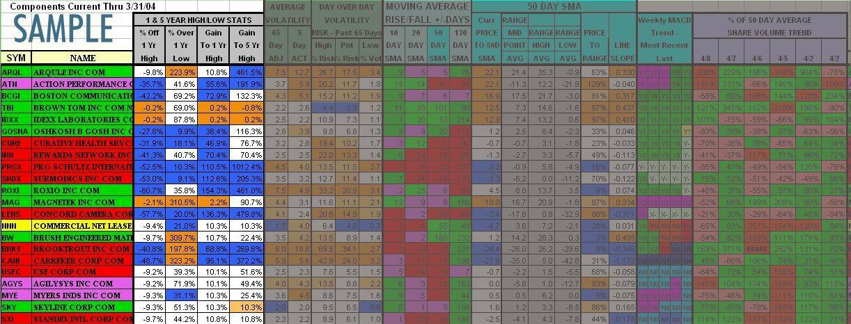
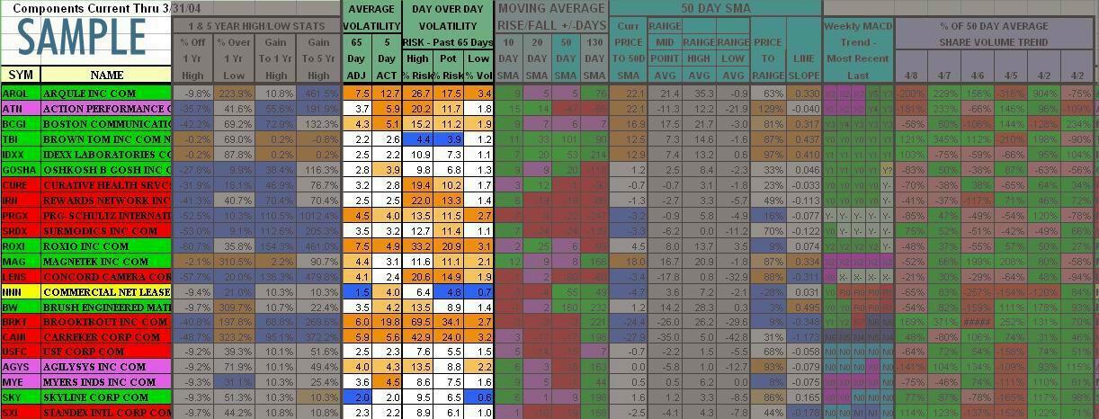
MOVING AVERAGE RISE/FALL +/- DAYS: - This group considers four Simple Moving
Averages (SMA) and indicates the consective number of trading days the moving average has been
rising or falling. The Simple Moving Averages are 10, 20, 50 and 130 day.
Positive numbers (usually green or purple..see explanations below) have been rising the indicated number of trading days,
Red negative numbers have been falling the indicated number of trading days.
I am using absolute colors for this group with a little deviation (see color
explanations below). The color code descriptions below are listed in order of
priority, as some may overlap.
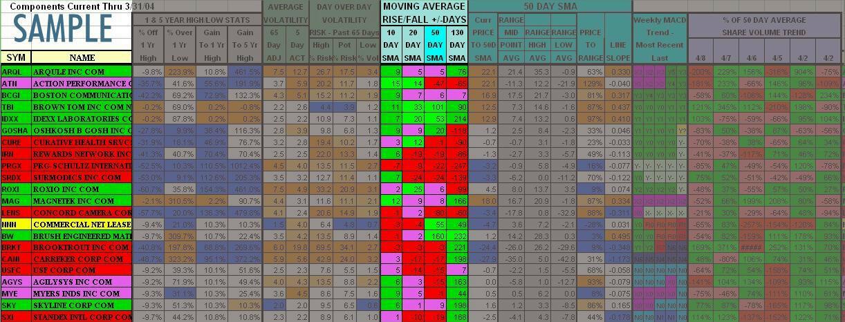
- 10 DAY SMA = Consecutive Number Of Trading Days The 10 Day SMA Has Been Rising or Falling(-)
- Purple = Early Stage Rise - Purple to get your attention, these
stocks 10 Day SMAs have been rising only 1 to 5 trading days. In the sample, CURE, ROXI, CANI, USFC and
SXI have recently turned positive.
- Bright Green = Top 10% - These stocks are in the top 10% bracket of
all stocks in the list with the greatest number of consecutive rising trading days. If less
than 10% of the stocks listed have rising 10 Day SMAs, the shortest consective falling
day string will be added to the color consideration. Thus, in extreme bear markets,
some falling 10 Day SMA stocks may appear bright green - the number will be negative.
This consideration will not override the above "purple" "early stage rise" coloring,
but will count them as part of the 10% consideration.
- Green = Rising 10 Day SMA More Than 5 Consecutive Trading Days - Unless overridden
by the "bright green" condition above.
- Red = Falling 10 Day SMA - These stocks 10 day SMAs have been falling the indicated
number of trading days (shown as a negative number) except when the "bright green" condition above
overrides in extreme bear markets.
- 20 DAY SMA = Consecutive Number Of Trading Days The 20 Day SMA Has Been Rising or Falling(-)
- Purple = Early Stage Rise - Purple to get your attention, these
stocks 20 Day SMAs have been rising only 1 to 10 trading days
- Bright Green = Top 10% - These stocks are in the top 10% bracket of
all stocks in the list with the greatest number of consecutive rising trading days. If less
than 10% of the stocks listed have rising 20 Day SMAs, the shortest consective falling
day string will be added to the color consideration. Thus, in extreme bear markets,
some falling 20 Day SMA stocks may appear bright green - the number will be negative.
This consideration will not override the above "purple" "early stage rise" coloring,
but will count them as part of the 10% consideration. In the sample, TBI leads having
its 20 Day SMA rising for 33 consecutive trading days.
- Green = Rising 20 Day SMA More Than 10 Consecutive Trading Days - Unless overridden
by the "bright green" condition above.
- Red = Falling 20 Day SMA - These stocks 20 day SMAs have been falling the indicated
number of trading days (shown as a negative number) except when the "bright green" condition above
overrides in extreme bear markets.
- 50 DAY SMA = Consecutive Number Of Trading Days The 50 Day SMA Has Been Rising or Falling(-)
- Purple = Early Stage Rise - Purple to get your attention, these
stocks 50 Day SMAs have been rising only 1 to 15 trading days. In the sample, ROXI's 50 Day
SMA has recently turned positive...is the 130 Day SMA next?
- Bright Green = Top 10% - These stocks are in the top 10% bracket of
all stocks in the list with the greatest number of consecutive rising days. If less
than 10% of the stocks listed have rising 50 Day SMAs, the shortest consective falling
day string will be added to the color consideration. Thus, in extreme bear markets,
some falling 50 Day SMA stocks may appear bright green - the number will be negative.
This consideration will not override the above "purple" "early stage rise" coloring,
but will count them as part of the 10% consideration.
- Green = Rising 50 Day SMA More Than 15 Consecutive Trading Days - Unless overridden
by the "bright green" condition above.
- Red = Falling 50 Day SMA - These stocks 50 day SMAs have been falling the indicated
number of trading days (shown as a negative number) except when the "bright green" condition above
overrides in extreme bear markets.
- 130 DAY SMA = Consecutive Number Of Trading Days The 130 Day SMA Has Been Rising or Falling(-)
- Purple = Early Stage Rise - Purple to get your attention, these
stocks 130 Day SMAs have been rising only 1 to 20 trading days
- Bright Green = Top 10% - These stocks are in the top 10% bracket of
all stocks in the list with the greatest number of consecutive rising trading days. If less
than 10% of the stocks listed have rising 130 Day SMAs, the shortest consective falling
day string will be added to the color consideration. Thus, in extreme bear markets,
some falling 130 Day SMA stocks may appear bright green - the number will be negative.
This consideration will not override the above "purple" "early stage rise" coloring,
but will count them as part of the 10% consideration.
- Green = Rising 130 Day SMA More Than 20 Consecutive Trading Days - Unless overridden
by the "bright green" condition above.
- Red = Falling 130 Day SMA - These stocks 130 day SMAs have been falling the indicated
number of trading days (shown as a negative number) except when the "bright green" condition above
overrides in extreme bear markets. In the sample, PRGX is really lagging having a falling
130 Day SMA for 247 consecutive trading days
______________________________________________________________________________________________________________________________________________
50 DAY SIMPLE MOVING AVERAGE (SMA) STATISTICS: - This group expands on
the previous groups 50 SMA data. It attempts to establish a channel for the stock
price baseed on the current duration of the 50 day SMA's rise/fall. This information
is only as dependable as the duration of the rise/fall. A stock with a short duration 50
day SMA rise/fall will not have a well established channel trend so don't give the
results much credence in this instance. The longer the duration of the rise/fall, the more
credence can be given to the results in this group. The three channel range columns
are grey throughout since I am not assigning any relative nor absolute significance.
The rest of the data is colored based on relative strengths.
- Curr PRICE TO 50D SMA = Current stock price-to-50 day SMA (+/- percentage)
- Dark Orange = Top 15% - This stock is in the top 15% bracket of
all stocks in the list in price-to-50 day SMA (highest) for the column
- Light Orange = Between Top 15% to 30% - This stock is in the second 15% bracket of
all stocks in the list in price-to-50 day SMA (high) for the column
- Blue = Bottom 20% - This stock is in the bottom 20% bracket of
all stocks in the list in price-to-50 day SMA (lowest) for the column
- RANGE MID POINT AVG = Channel mid-point for the current 50 day SMA rise/fall
duration in price-to-50 day SMA percentage terms.
- RANGE HIGH AVG = Channel top for the current 50 day SMA rise/fall
duration in price-to-50 day SMA percentage terms.
- RANGE LOW AVG = Channel bottom for the current 50 day SMA rise/fall
duration in price-to-50 day SMA percentage terms.
- PRICE TO RANGE = Where the current price-to-50 day SMA falls within the
calculated LOW/HIGH range above on a percentage basis. 100% would be the top of the range,
0% would be the bottom of the range.
- Dark Orange = Top 15% - This stock is in the top 15% bracket of
all stocks in the list within the channel range (highest) for the column
- Light Orange = Between Top 15% to 30% - This stock is in the second 15% bracket of
all stocks in the list within the channel range (high) for the column
- Blue = Bottom 20% - This stock is in the bottom 20% bracket of
all stocks in the list in within the channel range (lowest) for the column
- LINE SLOPE = The current slope of the 50 day SMA line presented as a
percentage based on the current 50 day SMA divided by the previous day's 50 day SMA.
- Dark Orange = Top 15% - This stock is in the top 15% bracket of
all stocks in the list in 50 day SMA line slope (greatest percentage rise) for the column
- Light Orange = Between Top 15% to 30% - This stock is in the second 15% bracket of
all stocks in 50 day SMA line slope (percentage rise) for the column
- Blue = Bottom 20% - This stock is in the bottom 20% bracket of
all stocks in the list in 50 day SMA line slope (greatest percentage fall) for the column
MORE TO COME....I'm getting there!!
The charts and tables here do not represent any recommendation from myself
to buy or sell any security. I also do not guarantee the accuracy of these charts
and graphs as the data is provided to me without guarantee.
HOME
I welcome and encourage feedback.